COLOUR
Everyone makes mistakes so the saying goes, and I don’t think there is an interior designer alive who would not admit (well maybe not publicly) to having made many in their career on their route to stardom. You can cut down on the likelihood by knowing a few tips and tricks, particularly about colour.
Selecting colours that pair well together is much easier once you consult a colour wheel.
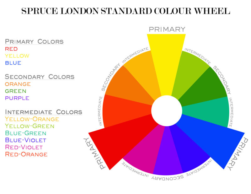
Primary Colours
Primary colours, red, blue and yellow, are the three colours that cannot be made from other colours.
Secondary Colours
Secondary colours, purple, green and orange are the colours you get by mixing two primary colours in equal amounts.
red + yellow = orange
red + blue = purple
blue + yellow = green
Tertiary Colours
Tertiary colours are the colours you will get if you mix a primary with a secondary colour, in a ratio of 2:1, eg red-orange, blue-green and so on.
Hot and cool colours
If you look at the colour wheel and you will see the left hand side of the colours are 'warm' or 'hot' and the ones on the right are 'cool' or 'cold'.
With warm colours you think of you think of the sun, heat, fire, orange and yellow go along with summer too, so when you want a warm and cosy look go for these warm colours.
Cool colours reflect ideas of water, ice, calmness, tranquillity, cleanliness, so if you want a lighter feel go towards the cool side.
Neutrals will go pretty much with anything, and can tone down a strong colour, these include, natural colours such as beige, cream and some browns, and even black, white. They give a good background colour and are easy to live with, however, they can give the impression of monotony and dullness if overused in an area. Browns and tans which are neutralised reds and yellows have a traditional association with a comfy, clubby environment.
Analogous Colours
These are quite close together on a colour wheel, and if you use these you will avoid clashes and will achieve harmony, and you can use a contrasting accent colour for lift.
Complementary Colours
If you want an accent colour that draws the eye and creates interest, you will find these on the opposite side of the colour wheel. For a more relaxed feel, slide to the left or right a little, and inward to a lighter shade, as these colours work great as accent colours.
Colour Schemes
Monotone Schemes
Monotone schemes use a single colour low in colour such as greys, beiges and tinted whites, are safe, and it’s almost impossible to get a harsh or clashing effect, but be careful of monotony, as its name suggests. Monotone schemes are a good background if you are going to introduce a colourful picture or object, or you have a stunning view.
Monochromatic Schemes
Monochrome schemes use a narrow range of colours such as is used in a red room with re-orange tones down through browns and tans. This is an easy mix, and will avoid clashes, but if a strong version of the chosen colour is introduced it can look harsh and be difficult to live with.
Analogous Colour Schemes
Analogous schemes achieve harmony by using colours that are close together on the colour wheel. Eg blue with blue-green and yellow-green, and virtually guarantees a harmonious look, and is less risky that monotone and monochromatic rooms.
Complementary Schemes
Complementary colour schemes uses contrasting colour from the opposite side f the colour wheel, eg greens with reds, oranges with blue, yellow with violets, and need to be skilfully done to avoid garishness, but can be successful when they are done well.
The 60 30 10 Decorating Rule
A good starting point is to roughly give over 60% to the dominant colour, this is mostly for the walls. You can then use 30% in a secondary colour. The remaining 10% save for an accent colour. This will give a balanced look but don’t be afraid to experiment.
The Spruce Inspirations and Ideas are on our Pinterest page. Pinterest is perfect for gathering design ideas from different sources into one place - create your own mood board online.